Predictive Analysis and Churn Modeling
Predictive Analysis and Churn Modeling
Introduction:
Churn is a word in Telecom Industry which refers to customers. In present day of living people who are customer of one company may also be the customer of another company. Change in job responsibilities may also change the priorities of the customer to opt for one company to another based on the services provided.
The dataset has been downloaded from Kaggle. This data is all about the telecommunication company who is concerned about their customers leaving their company or losing them to their competitors. The data is all about the customers who left the company during a period of one month are known to be churners. In dataset column churn represents with binary values who has left the company as "1" and who did not left the company is represented as "0". The data set provides information about the services each customer has signed up,demographic and account information.
Data Pre-Processing:
In this we have removed missing and misleading values. In the data set few records have NA's of column Total Charges.when analysed the data between tenure,monthly charges and total charges the tenure of the customer is 0 for the given customer records with NA's in the Total charges feature. Monthly Charges has values but with out a tenure charges can't be applicable so we remove all the rows containing 0 as the tenure.
Data Visualization:
This data set contains class labels Churners vs Non Churners.Which is two class label means binary classifier. This data set is about customers who left the company in one month. In one month 26.5% of the customers has left the company. Customers who did not left the company is about 73.4% of the total customers. The class label is called Churn. In Churn Column customers who left the company are represented as Yes,who didn't represented as No.
 |
| Churners Vs Non-Churners |
Data Visualization for Categorical Data:
When we see pictures talks more when compared to writings. Here you can see data Visualization for categorical and continuous data. Categorical data has been represented with bar plot and Continuous data with Box-plot. Each feature has been represented against the feature Churn. In Each plot you can see that.


Data Visualization for Continuous Data:
In Continuous data when we compare all the three at one glance you get an insight that the customers whose monthly or base charges high ,with total charges are low had churned first compared to the other customers.
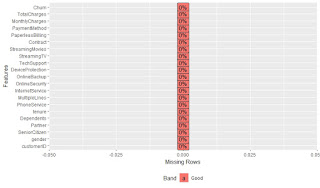
After Visualization we again check once for missing values or misleading values. If the records are more in number we may not find every possible value when we visualize if any data we miss it may be visualized in the plot for categorical data.
Statistical Analysis:
We have drawn 35 random samples for 1000 times using central limit theorem
we have found the probability of 0.19 for 7713.55 or less for Total Charges
For Monthly or Base Charges for <=107.5 probability is 0.922
Logistic Regression:
Regressor model
ANOVA:
Evaluation:
The performance of the model has evaluated using Receiver Operating Characteristic (ROC). The Performance is evaluated here using Area Under Curve (AUC). More the area under the curve, better the performance of the model. If the curve is above the linear line the model is considered as a good one and if curve is down the linear line then it can be said to be as the bad model, according to ROC. The fig shows the ROC of Logistic Regression with AUC is 83.7 which is good model.


Comments
Post a Comment